A Deep Dive Into Print Css Headers and Footers
For a project I’m working on, I had to become very familiar with the print CSS styles for headers and footers. The goal is two fold: 1) to have a nice printable version and 2) to use a chrome-pdf tool to download as PDF.
Regardless of the two consuming sources, I just wanted to solve this all as one html/css file. So, it was necessary to explore all of the different options we have now, in 2025, on Chrome.
In this blog entry, see print (pdf) versions of the different header/footer functionality in CSS including built-in page margin and header/footer tools as well as fixed/forced hacks.
Ok - let’s walk through this. I’m going to start out with a template, and then slowly add on additional things and show the output. I’m not going to go into the nuance of why each thing does what it does - this is more of a quick reference to try to figure out what you should focus on - if you have to build this.
The Template
<html>
<head>
  <meta charset="utf-8" />
  <style>
    html, body {
      margin: 0;
      padding: 0;
    }
    main {
      padding: 0.5in;
    }
  </style>
</head>
<body>
  <main>
    <section>
      <p>
        Bacon ipsum dolor amet tongue pastrami pork loin, bacon pork
        belly landjaeger flank swine pancetta rump pork hamburger.
      </p>
      <!-- 2 more paragraphs -->
    </section>
    <section>
      <p>
        Turducken brisket chislic picanha meatball spare ribs.
      </p>
      <!-- 2 more paragraphs -->
    </section>
    <section>
      <p>
        Bacon ipsum dolor amet tongue pastrami pork loin, bacon
        pork belly landjaeger flank swine pancetta rump pork hamburger.
      </p>
      <!-- 89 more paragraphs -->
    </section>
    <section>
      <!-- 2 more paragraphs -->
      <p>
        Ham hock shankle chicken leberkas frankfurter jowl
        tail biltong pork belly venison boudin strip steak landjaeger
        spare ribs. Chuck sirloin boudin t-bone beef ribs,
        turkey strip steak pork.
      </p>
    </section>
  </main>
</body>
</html>
Obviously, to keep this blog entry smaller, I snipped out some content. But the major thing to note is - this is the main starting point for all of the upcoming examples. It’s very simple.
The rest of the examples do not require html to be edited. Because of that, I’ll only be sharing the CSS.
Simple Positioning
Page 1:
Page 2:
html, body {
margin: 0;
padding: 0;
}
main {
padding: 0.5in;
}
@media print {
html {
background-color: #cc8888;
}
body {
background-color: #88cc88;
}
main {
background-color: #8888cc;
}
main {
box-decoration-break: clone;
}
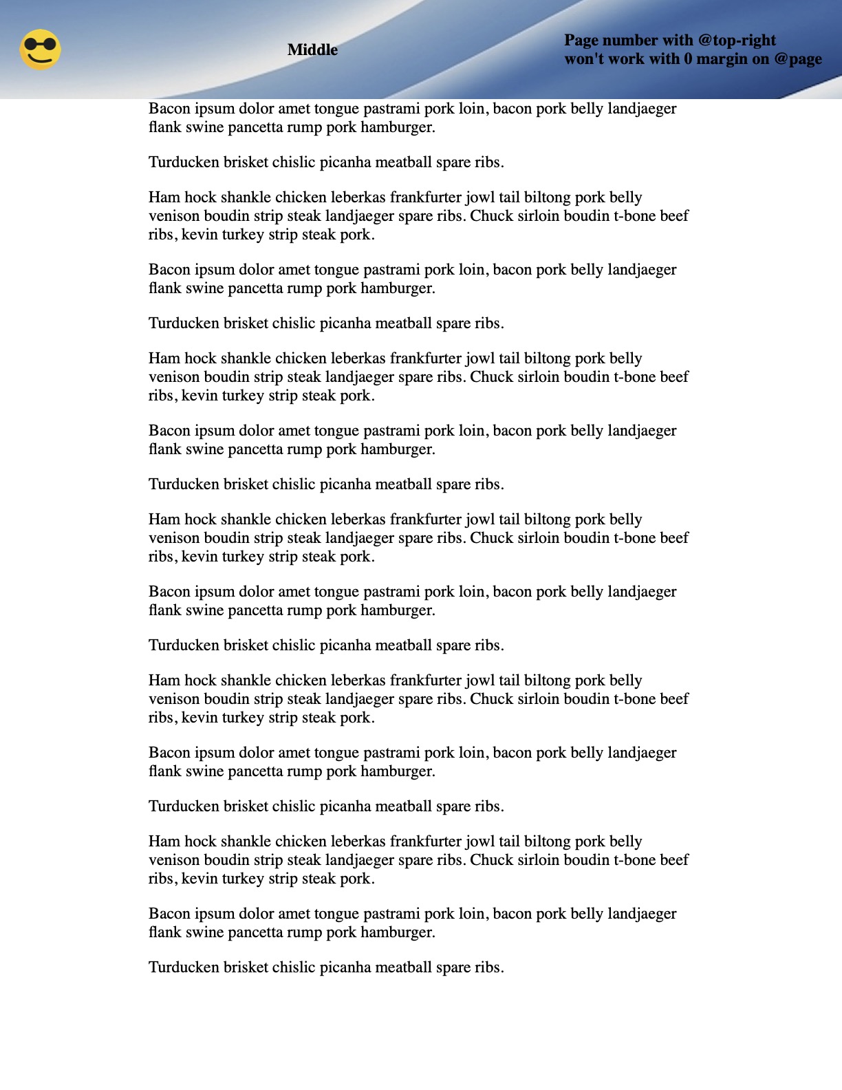
@page {
background-color: #5588ff;
margin: 0.75in 0.75in 1.25in 0.75in;
@top-left {
content: 'i am left';
background-color: #ccc;
}
@top-center {
content: 'I am top center';
font-weight: bold;
color: blue;
}
@top-right {
content: 'top right ' counter(page);
}
@bottom-center {
content: 'bottom';
border-top: 3px solid red;
}
}
}
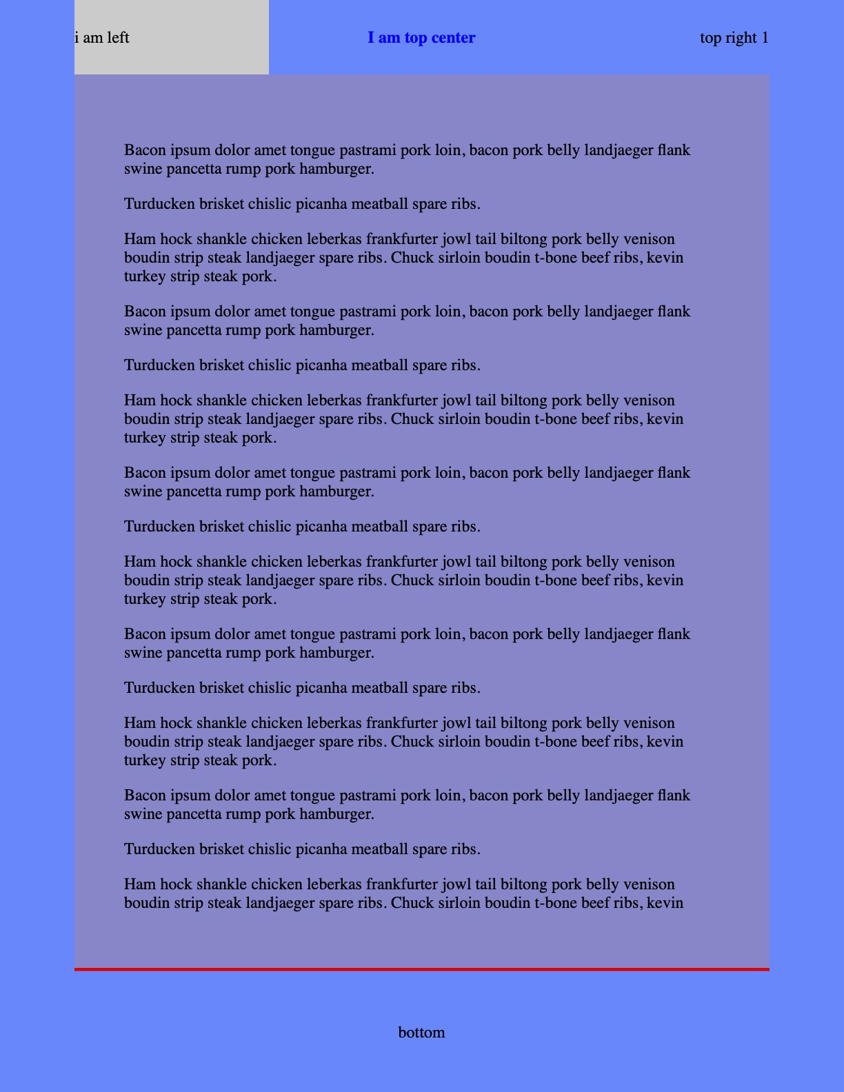
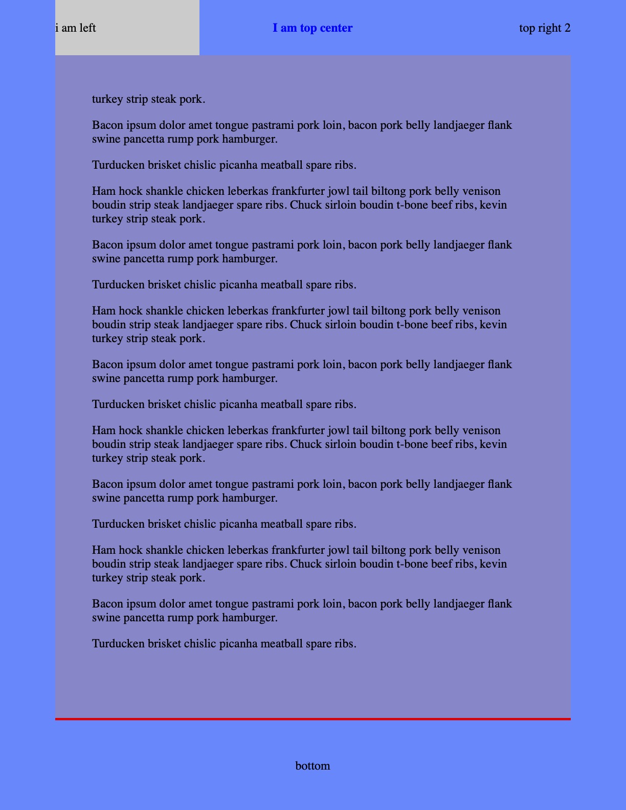
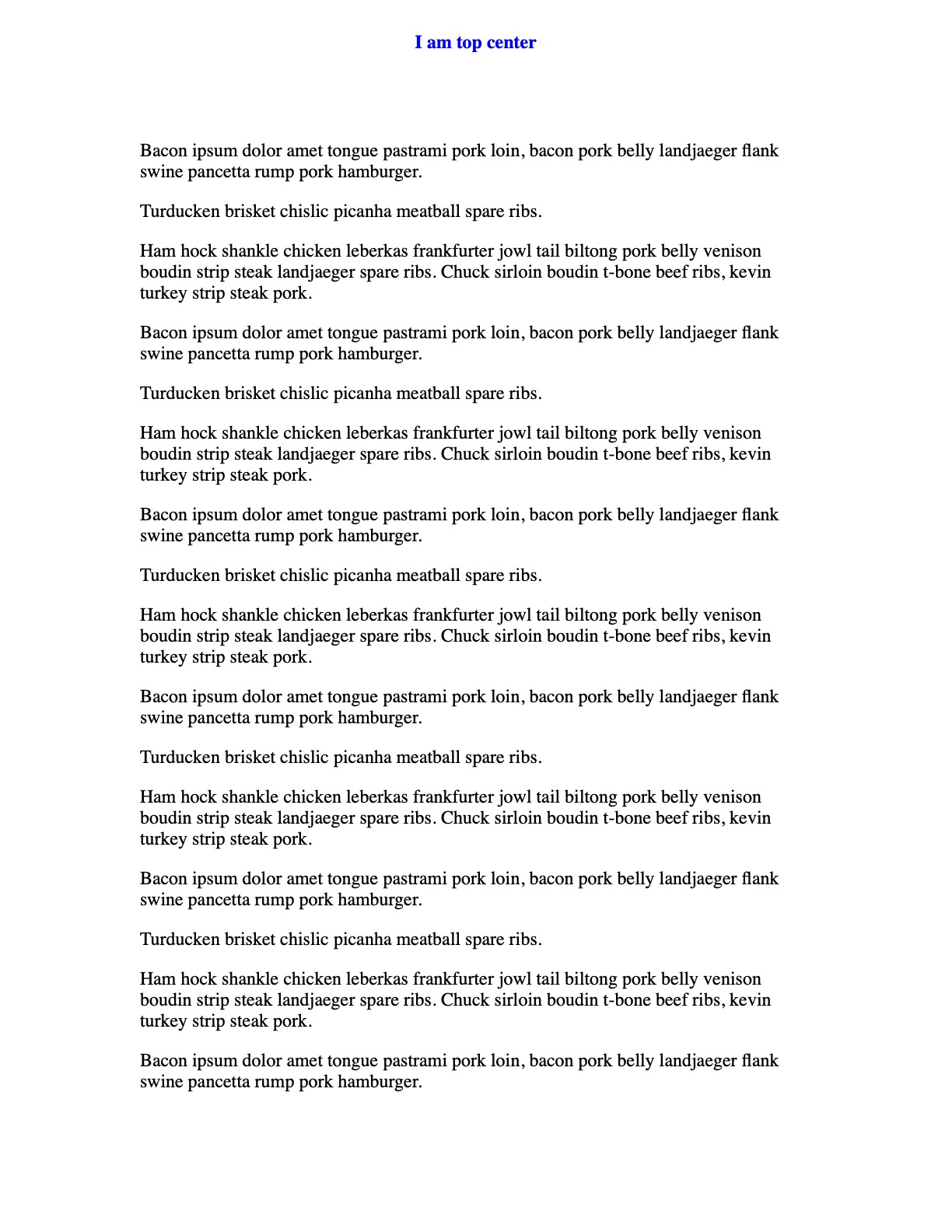
I added coloring and additional content - just to start to show our points on the screen. Notable things: the @page margin is set, using things like @top-left to place content, @top-right shows how to access a page counter.
Important note this page counter only happens with a css counter inside of the @page declaration. This will come up as a theme again and again.
Simple positioning with background and spacing
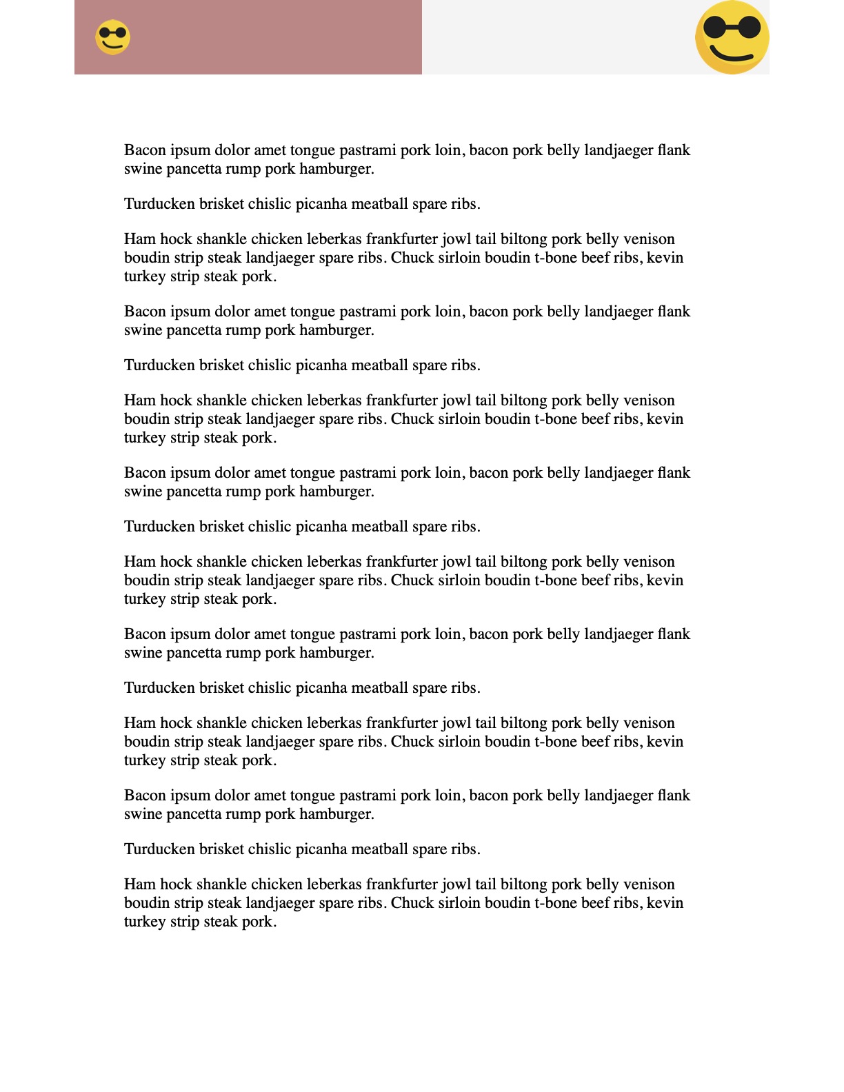
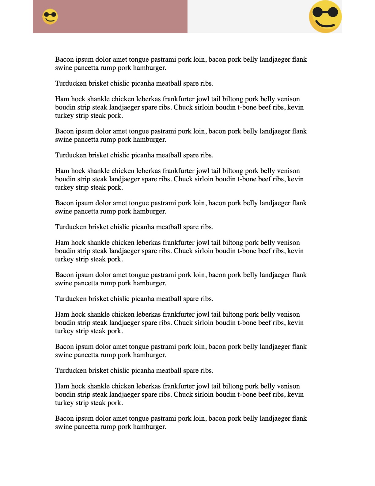
So let’s say we want to stay on this technology / methodology choice, but make a more rich footer. I want to have left right and center values, and a nice background. I also want the page number with a new line break.
I think we can do that.
html, body {
  margin: 0;
  padding: 0;
}
main {
  padding: 0.5in;
}
@media print {
  main {
    box-decoration-break: clone;
    padding: 0;
  }
  @page {
    margin: 0.75in;

    @bottom-left {
      content: 'Left content';
      background-color: #557799;
      color: #fff;
      padding-left: 10px;
      vertical-align: bottom;
    }
    @bottom-center {
      content: 'middle content';
      background-color: #557799;
      color: #fff;
    }
    @bottom-right {
      vertical-align: top;
      content: 'Right content';
      background-color: #557799;
      color: #fff;
      padding-right: 10px;
      padding-top: 20px;
    }
    @top-right {
      content: "Document Title" "\A" "Page " counter(page);
      white-space: pre-wrap;
    }
  }
}
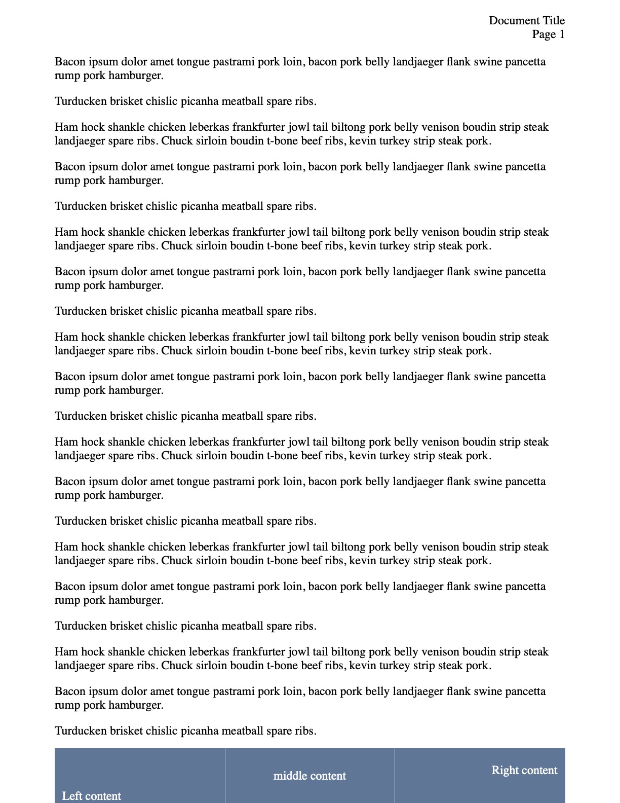
Let’s see the notable content. First, the backgrounds all line up in the footer. Nice. But it does appear that there are times when there can be a little bit of a border peeking through. Not great.
Another thing to mention - note the box-decoration-break: clone declaration. This is because when things have padding, they don’t follow that pattern on the next page. This tells it to. It’s less applicable in this example, but you’ll see it more often as well.
The biggest thing to note here is that the @top-right is using white-space: pre-wrap and a \A newline character to get the page break. This is the only way that works. There is no formatting allowed here display/position wise, otherwise.
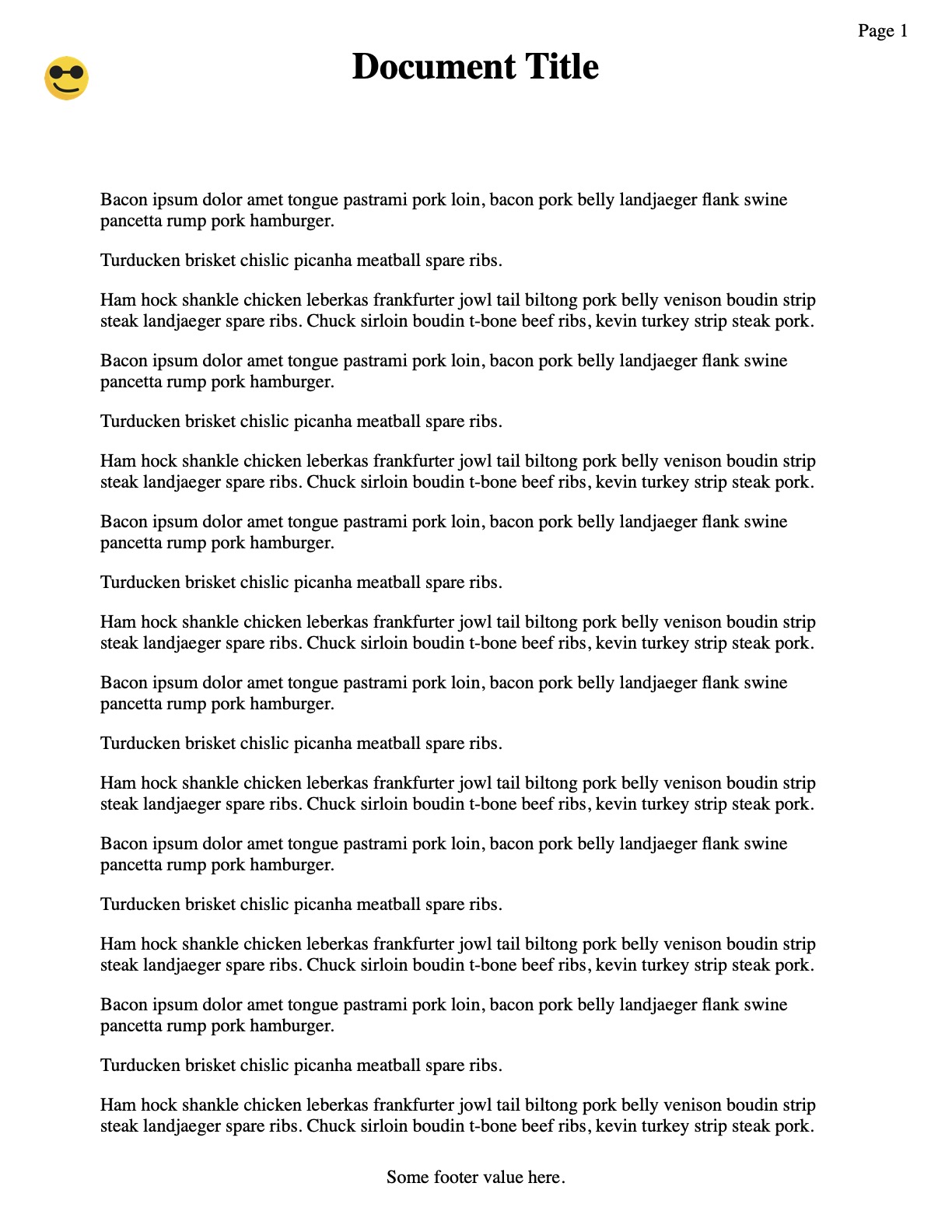
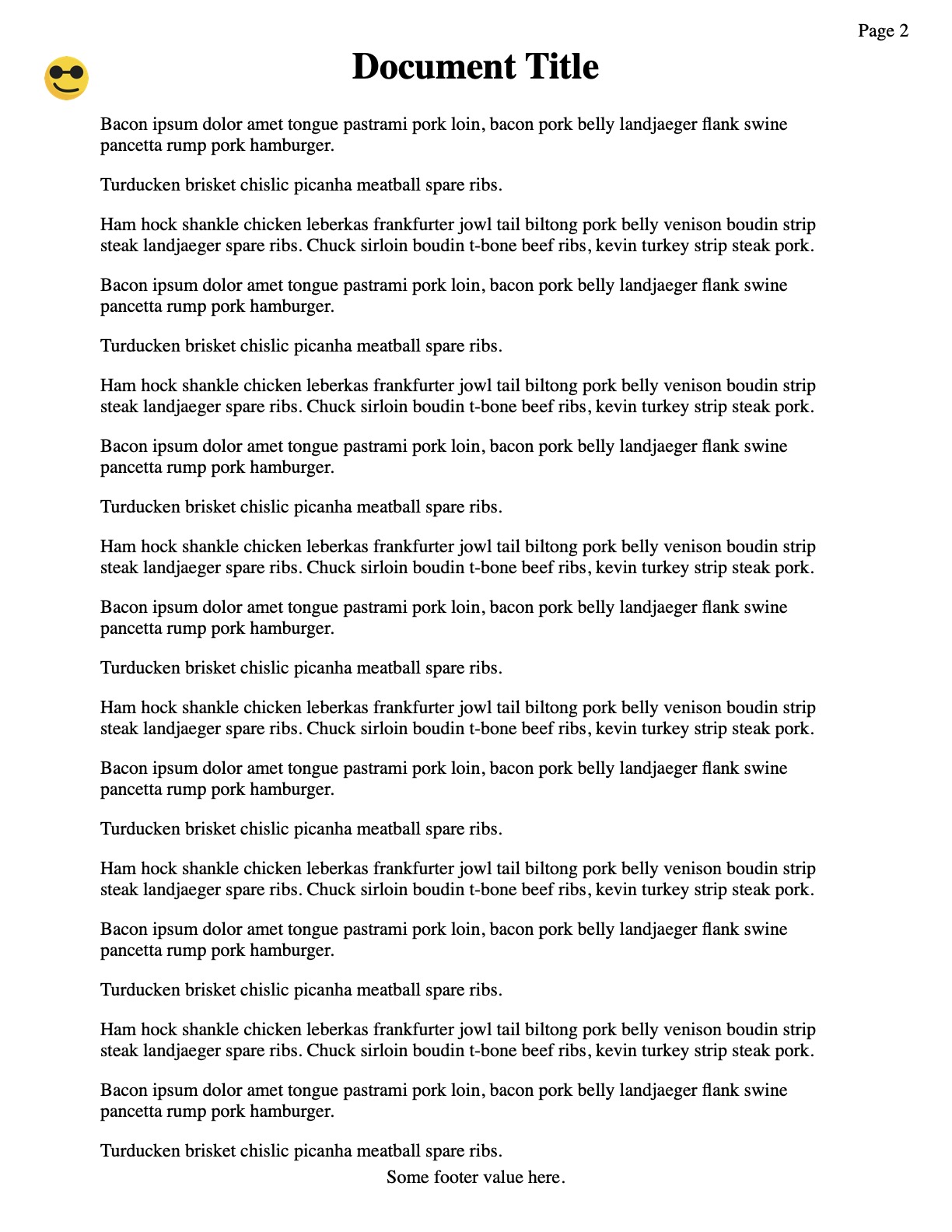
Hiding the First Page
I’ll cut this off right now - it’s easy to apply styling to :first, :last, :left (odd pages) and :right (even pages). But it’s not so easy to target the 3rd page, for example. So, this is a simpler example. I can hide the header on the first or last page easily. No problem.
html, body {
  margin: 0;
  padding: 0;
}
main {
  padding: 0.5in;
}
@media print {
  main {
    box-decoration-break: clone;
  }
  @page {
    margin: 0.75in;

    @top-center {
      content: 'I am top center';
      font-weight: bold;
      color: blue;
    }
  }
  @page:first {
    @top-center {
      content: none;
    }
  }
}
There’s not much to say about this one. The big thing to note is that hiding the content for @top-center is setting content to none or ''.
Adding Images
In this next example, I wanted to try using images for the content. I found out quickly that using an image for content directly is not great. It’s the only thing you can do. So it has to be the exact size, no modifications or text overlays.
You can use a background image. I added background colors to show again how the spacing works (especially interesting when you don’t use a center value).
html, body {
  margin: 0;
  padding: 0;
}
main {
  padding: 0.5in;
}

@media print {
  main {
    box-decoration-break: clone;
  }
  @page {
    margin: 0.75in;

    @top-center {
      content: '';
      background-image: url('logo.png');
      background-color: #f4f4f4;
      background-repeat: no-repeat;
      background-position: top right;
      background-size: 0.75in auto;
    }
    @top-left {
      content: '';
      background-image: url('logo.png');
      background-color: #cc8888;
      background-repeat: no-repeat;
      background-position: 20px center;
      background-size: 0.35in auto;
    }
  }
}
Note the @page margin of 0.75. This is the exact same size as the @top-center which shows you the full size image (well shrunken to the full viewport). Remember the spacing and background color? Note that the right side is really center…
Simple Positioning with full image
Sadly, we can’t easily get a full image across using this simple position.
html, body {
margin: 0;
padding: 0;
}
main {
padding: 0.5in;
}
@media print {
main {
box-decoration-break: clone;
}
@page {
margin: 0.75in;
@top-center {
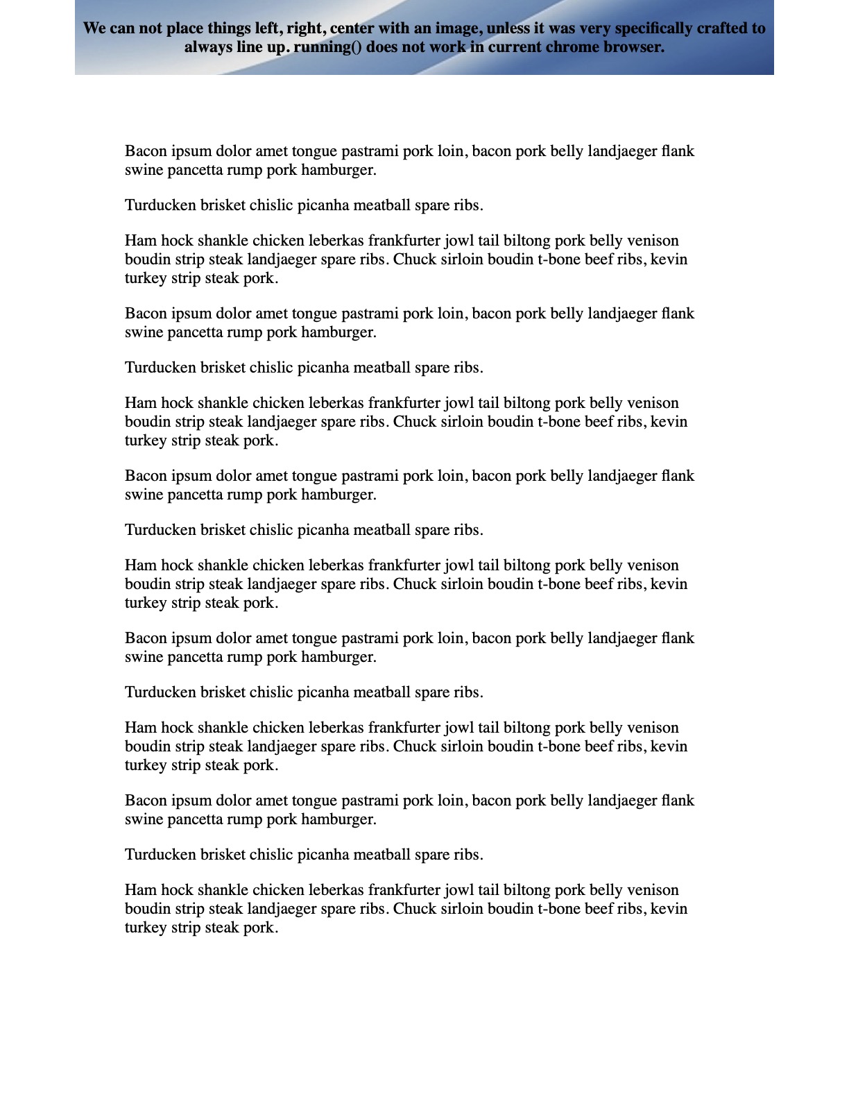
content: 'We can not place things left, right, center with an image, '
'unless it was very specifically crafted to always line up. '
'running() does not work in current chrome browser.';
background-image: url('background.jpg');
background-repeat: no-repeat;
background-position: center center;
padding: 5px;
font-weight: bold;
}
}
}
So it looks nice, but it’s not that useful. It’s nice for a full image with only one overlay - and you can have page number counter. But that’s about it. No complicated layouts. Maybe some new-line with \A.
Using Table Header and Footer
Another way to accomplish this may be to use the <thead> and <tfoot> tags inside of a table. The spec says they should repeat on each page. I’ll give you the issue right now… we can’t hide the first or any of the header or footers. So this is only a simple demonstration - not really useful if you need customization. However, it does give you flexibility in the content that can be in the header/footer.
html, body {
  margin: 0;
  padding: 0;
}
main {
  padding: 0.5in;
}

@media print {
  table {
    width: 100%;
    border-collapse: collapse;
  }
  thead {
    display: table-header-group;
  }
  tfoot {
    display: table-footer-group;
  }

  .header-left   { text-align: left;   width: 33%; }
  .header-center { text-align: center; width: 34%; }
  .header-right  { text-align: right;  width: 33%; }
  .footer-center { text-align: center; }
}
And this one actually requires html changes. This is what that looks like.
<body>
  <table>
    <thead>
      <tr>
        <td class="header-left">
          <img src="logo.png" alt="Company Logo" style="height: 1cm;">
        </td>
        <td class="header-center">
          <h1>Document Title</h1>
        </td>
        <td class="header-right">
          <span>Revision 1.0</span>
        </td>
      </tr>
    </thead>
    <tfoot>
      <tr>
        <td colspan="3" class="footer-center">
          <span>Some footer value here.</span>
        </td>
      </tr>
    </tfoot>
    <tbody>
      <tr>
        <td colspan="3">
          <main>
            <section>
              <p>
                Bacon ipsum dolor amet tongue pastrami pork loin, bacon ...
              </p>
  <!-- snip -->
</body>
A thing to note - the body needed to have that colspan="3" or otherwise the body was only the width of the first column. That makes sense.
This works, but it’s not great. Since this is not using the simple positioning, I don’t have the page number…
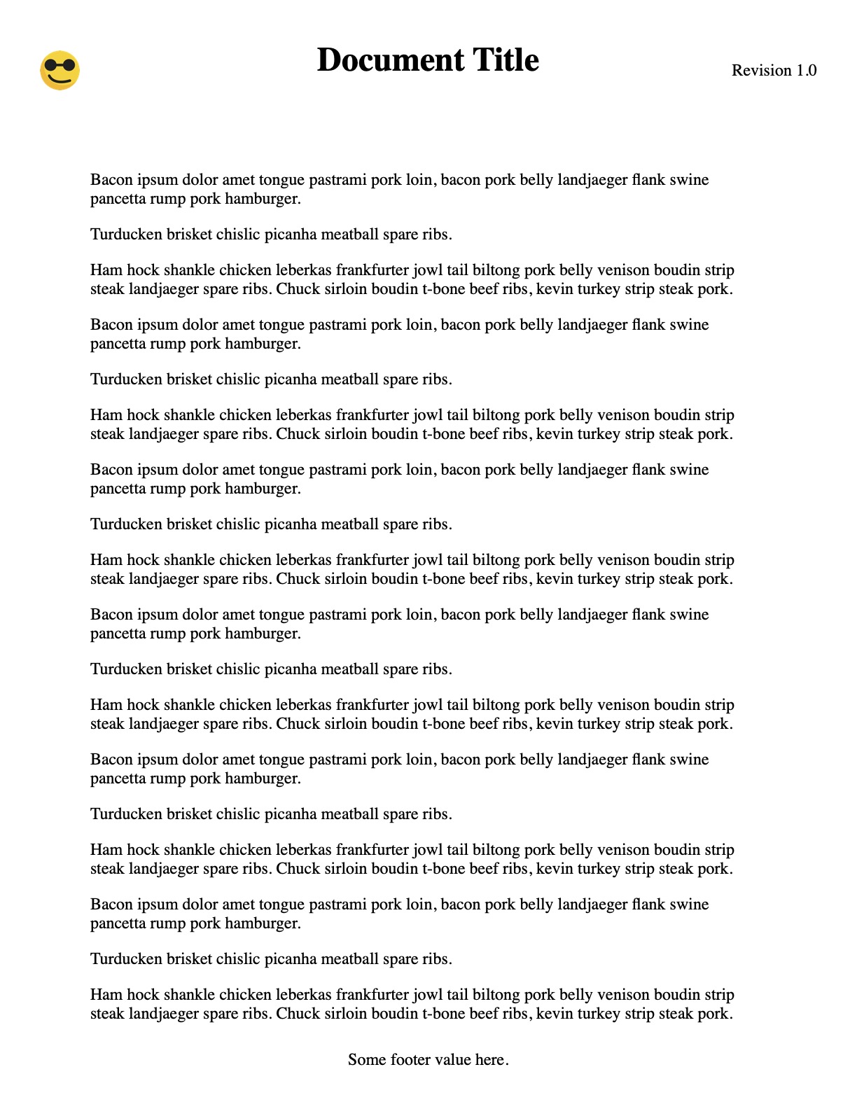
Combine Table and Simple Positioning
While this isn’t perfect, we can combine these two bits of functionality to get that table layout with a page number.
html, body {
  margin: 0;
  padding: 0;
}
main {
  padding: 0.5in;
}

@media print {
  table {
    width: 100%;
    border-collapse: collapse;
  }
  thead {
    display: table-header-group;
  }
  tfoot {
    display: table-footer-group;
  }

  .header-left   { text-align: left;   width: 33%; }
  .header-center { text-align: center; width: 34%; }
  .header-right  { text-align: right;  width: 33%; }
  .footer-center { text-align: center; }

  @page {
    @top-right {
      content: 'Page ' counter(page);
      padding-top: 15px;
    }
  }
}
A small change to the header html.
<thead>
  <tr>
    <td class="header-left">
      <img src="logo.png" alt="Company Logo" style="height: 1cm;">
    </td>
    <td class="header-center">
      <h1>Document Title</h1>
    </td>
    <td><!-- attempting to put page here --></td>
  </tr>
</thead>
Here we’re able to keep the space open in the table for the content - and then the @top-right will position the page as in the open place.
It’s important to keep in mind that the @top-right falls into open @page margin. So, since we have allowed the default, it can be there. If we were doing this header a different way… with no page margins… you’d never see this content. (foreshadowing to a future problem).
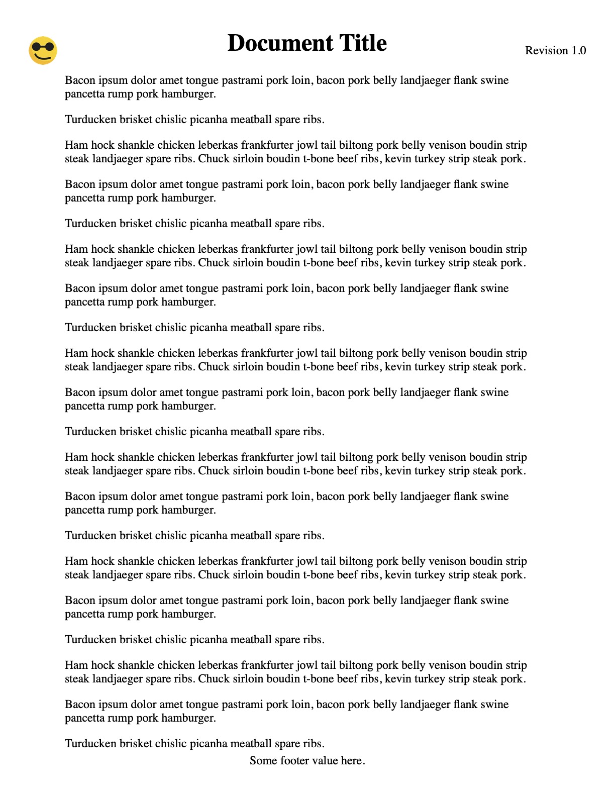
Position Fixed Header and Footer
When we use the fixed position in css for print, it will be repeated on every page. Imagine each page as a full scroll down. It’s there again. This is cool, except it has some limitations as well.
You have to be careful with the fixed positioning because it’s view-port based. That’s to say, it’s based on your @page margin. This means you can’t combine things like @top-right with this because it’s removed all margin.
Also, you’ll notice that we can’t hide a specific one. They either show up or they don’t.
we’re back to the table-less html now
html, body {
  margin: 0;
  padding: 0;
}
main {
  padding: 0.5in;
}
header, footer {
  display: none;
}

@media print {
  @page {
    margin: 0;
  }
  body {
    padding: 1in;
    box-decoration-break: clone;
  }
  header {
    display: block;
    position: fixed;
    top: 0;
    left: 0;
    right: 0;
    width: 100%;
    height: 1in;
    box-sizing: border-box;
    padding: 0.2in;
    background-color: #f0f0f077;
  }
  footer {
    display: block;
    position: fixed;
    bottom: 0;
    left: 0;
    right: 0;
    width: 100%;
    height: 1in;
    box-sizing: border-box;
    padding: 0.2in;
    background-color: #ccffff77;
    text-align: right;
  }
}
I placed background colors again - so you can see where the fixed boundaries are. There’s nothing really that crazy here once you understand the simplicity - its a complex element you can put at the same place, starting from the paper’s edge (if you want).
Fixed Position With that Header Image
Remember the header image we tried before? We can do that much nicer on the fixed version. However, remember, no page numbers.

html, body {
  margin: 0;
  padding: 0;
}
main {
  padding: 0.5in;
}
header, footer {
  display: none;
}

@media print {
  @page {
    margin: 0;
  }
  body {
    padding: 1in;
    box-decoration-break: clone;
  }
  header {
    position: fixed;
    top: 0;
    left: 0;
    right: 0;
    width: 100%;
    height: 1in;
    box-sizing: border-box;
    padding: 0.2in;
    background-image: url('background.jpg');
    background-position: center center;
    display: flex;
    justify-content: space-between;
    align-items: center;
    font-weight: bold;
  }
}
The important thing to note here is the use of flex (awesome) and the background image. But, as you can see in the screenshot, we don’t have page numbers.
What Should We Do?!
Awesome. So I’ve shown all the different ways (at least that I can think of) to do this header/footer print css functionality. But what do you choose moving forward?
I guess it depends. It depends on how complex you need it, and if you need page numbers.
There’s no one single answer. But, I’m going to try to use the simple positioning and hope for the best with background colors, when I need them.
Oh, and if you want all of the source files for this, including the PDF outputs, you can download that here.