My site re-design: Simpler, faster, but less user-friendly?
So, after reading some of my own entries on my blog, I realized that my last re-design made the font kind of hard to read. Plus, I was reading it on a 27" monitor, and it became hard to keep the long lines of text straight. So, I opted for a re-design… but not before I looked at my Google Analytics.
Well, first of all, let’s talk about my goal. My goal was three-fold:
- Standardize how all my entries are written and formatted. This meant going through EACH one from the last decade and making sure the mark-up was fine, the code blocks all matched, etc. (It’s rather hard to edit old code to match a style without ‘fixing’ it. heh)
- Make the reading experience easier. I found it hard to read myself, so why would other people not feel the same way?
- Make it simpler: focus on just the parts of my website that people cared about.
The Old Design
So, the first thing to do is let’s check out the ‘old’ design:
The home page focused on just a simple announcement of who I was. I think I mainly did this, too, for the SEO advantages (more on how SEO “mattered” later). The main content of my website is my blog, of which that was only a menu option.
The blog entries list was kind of plain. No previews because I had decided to not use pagination when I switched to Jekyll. So, I was concerned how big of a page / how heavy a page with headings and preview text would be (turns out, not that much…)
The blog entry page was clean, had good code highlighting, but seemed a bit hard to read, especially in the longer blog entires. Additionally, the inline code blocks seemed to really jump out at you and disrupt your reading.
The New Design
Well, the first thing I did was decide that I wanted a more readable font. After reviewing other web-fonts, I figured I’d just go with standard web browser based fonts. These days, user agents make more of them available to the web. So, I opted for some built in serif fonts. I chose serif because monitors and phones have higher resolutions than they used to - so the idea that sans-serif fonts are easier to read for text on them - I just don’t buy that anymore.
Next, I restricted the maximum width of the pages. This was to stop it from creating forever-wide pages for people with wide monitors. Yes, it’s nice to have a giant monitor, but most people with them either don’t maximize their browser or appreciate the reading experience being curated I’m sure.
Finally, the most humbling thing, going to Google Analytics. 95% of my search results arrived on a blog page, and bounced away. A couple percent arrived on my home page searching for my name. Only a few arrived on their searching for the things that I’ve optimized for: “Milwaukee PHP Web Developer.” You know what, I remember those people emailing me - they were usually just web-scraping recruiters that never read my resume anyway.
Speaking of resume, I can’t point to more than one ‘real’ person a month who actually clicked on that link. I had more views on the resume than that, but I think that’s because I would actively send the link directly when I was looking for work.
No one clicked my ‘Open Source’ link (however, 10’s of thousands of people use my open source projects..) People must find me directly on Github.
Finally, when people actually are on my blog entries, they rarely click through to other ones. In fact, most often they bounced up to the ‘blog’ link, and didn’t browse through. 95% of my readers, remember, bounce away. I think that has something to do with the style of writing I do, too. That, and how people consume media these days. (I’m one of the rare ones I think that read through another blogger’s blog if I find one of their articles interesting.)
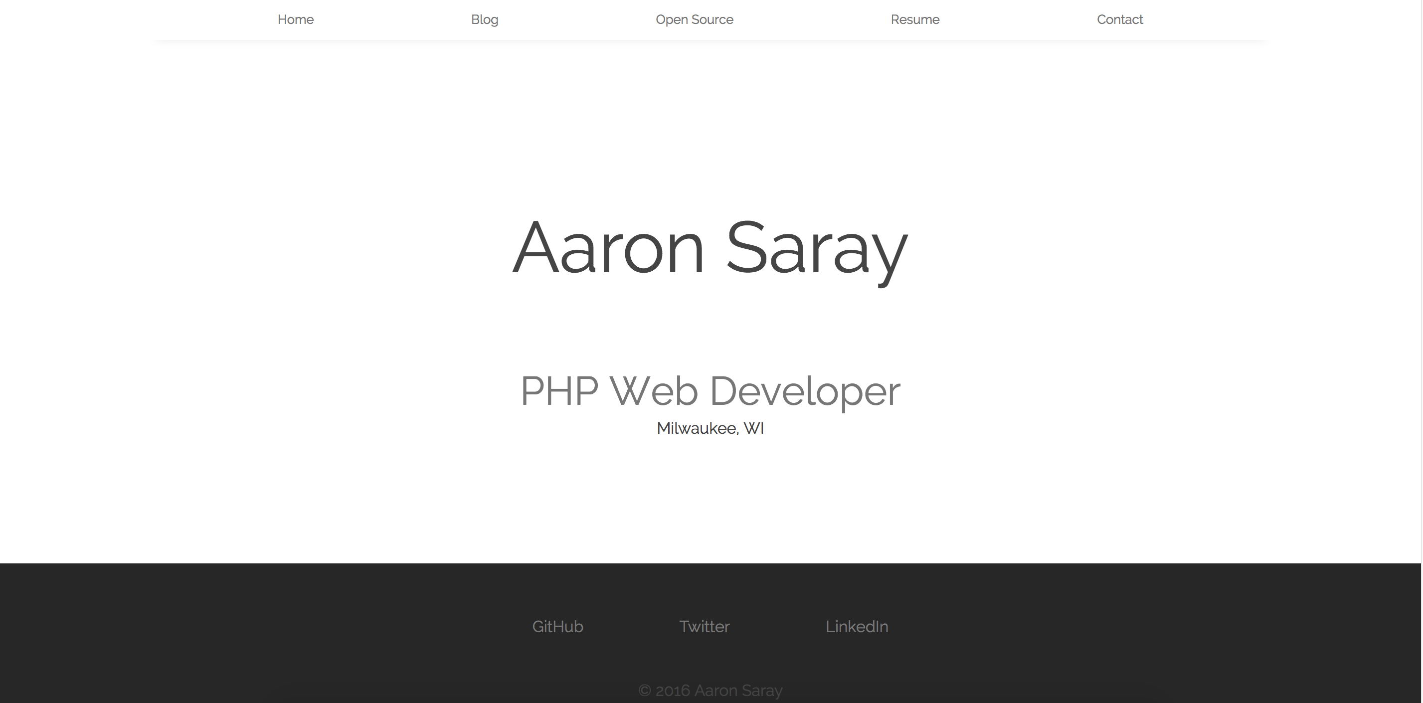
So, I decided to make my redesign with that
It still says who I am, but it’s cleaner, simpler, and the menu has been slimmed down to the only two functions that people really use: The return to home - and the contact page. These pictures don’t show the footer, but links to my Github, LinkedIn, Twitter and Resume appear in there. Then, the home page just shows the first 5 entries with a link to read more. I decided to give the people what they wanted. No one came to my website to explore, it was just for the blog (and that’s what I wanted, right?)
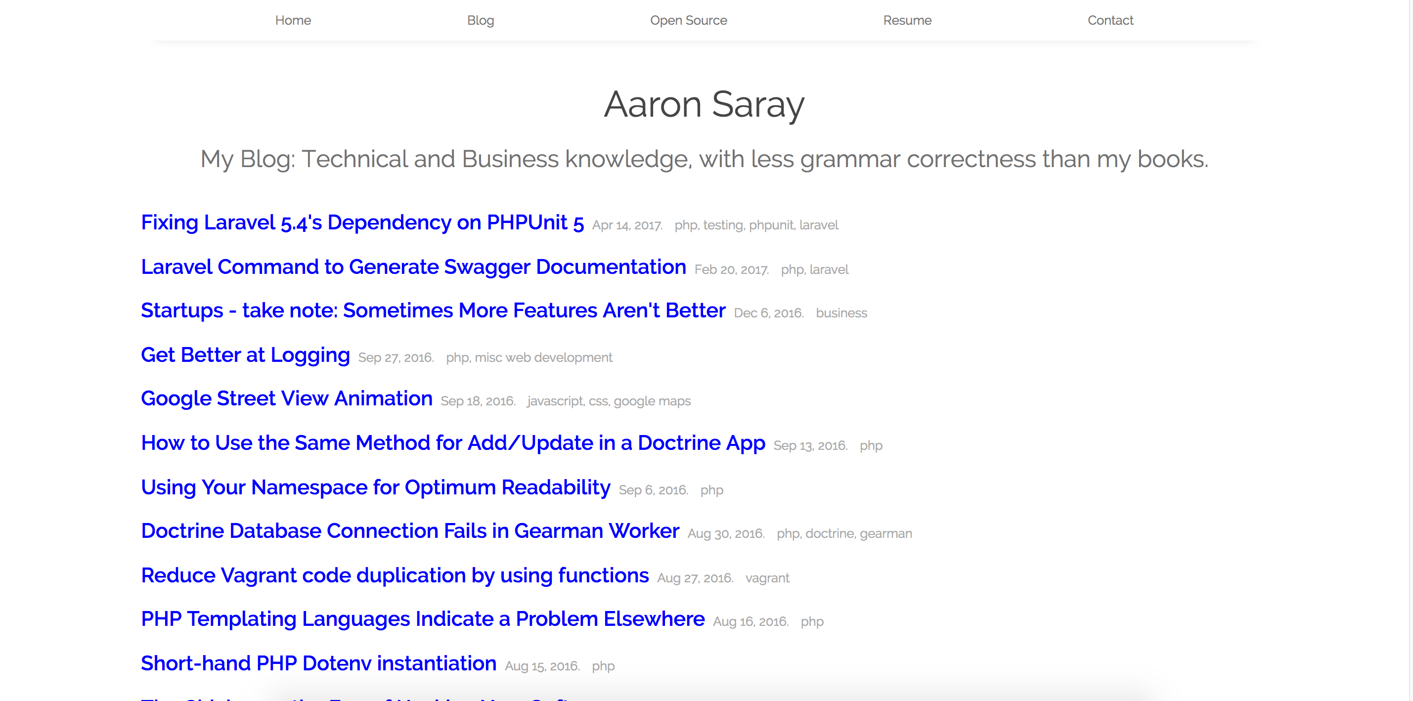
On the blog list, I am still showing all the entries. However, I’ve added more spacing. Oh, and the elephant in the room… previews. (I’m going to cover performance next.)
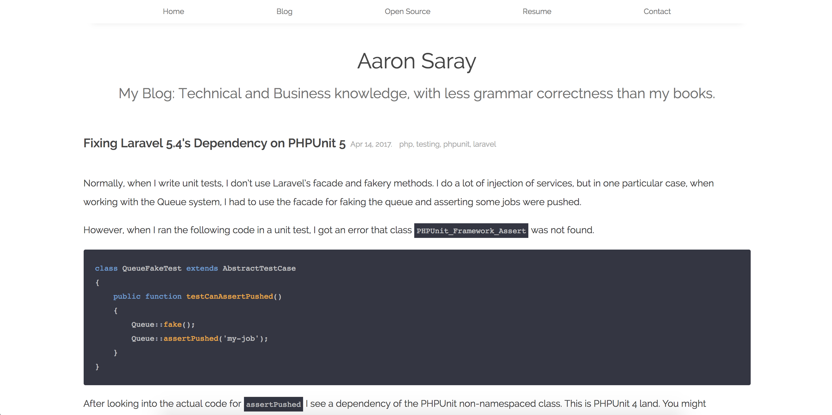
When you click through to a blog entry, you see this:
The page content is less wide, the font makes it easier to read. The highlighting of code is the same, but the inline is much nicer to read. A couple big things I did: I went through EVERY code sample to try to make sure that they fit on the screen, without scrolling, at the largest allowed width. Additionally, I went through and standardized file name highlighting, and made every effort to mark as code the inline variable names and method names. A LOT of work. I also did spell-check on all entries. Oops!
Why Less User Friendly?
I guess I don’t know if it’s less user-friendly, but I took away a lot of options. I think that I would have kept them, but really they just slowed people down getting to their content, which is all they wanted. I was so glad I checked out Google Analtyics to get a bit set straight.
Performance
So, performance was an interest to me. I wondered about the performance hit with a web-font on the old design - and then I wondered about the performance hit with text-previews on the new site. Luckily I kept the har files for future reference.
If you’re crazy stalker, and you really care, here they are:
aaronsaray.com-before-homepage.har, aaronsaray.com-before-blog-list.har, aaronsaray.com-before-blog-entry.har
aaronsaray.com-after-homepage.har, aaronsaray.com-after-blog-list.har, aaronsaray.com-after-blog-entry.har
I realize, these aren’t ultimately accurate, because I have some Google analytics in there as well, but they’re close enough for this particular conversation.
Here is the breakdown of the speeds/sizes and comparisons.
| Page | When | Number of Requests | Size | Time |
|---|---|---|---|---|
| Home | Before | 5 | 158.2k | 382ms |
| Home | After | 4 | 39k | 148ms |
| Blog List | Before | 6 | 353.7k | 567ms |
| Blog List | After | 4 | 404.3k | 308ms |
| Blog Entry | Before | 6 | 336.2k | 463ms |
| Blog Entry | After | 4 | 41.3k | 140.9ms |
Please note: I did alter some of the totals. I took away the 307 redirects from the ‘after’ because that’s happening only because I’m developing locally. In production (when this is pushed live), that won’t happen.
End Notes
So I’m pretty happy with the redesign. Everything is more readable, even faster (don’t really see many WordPress websites doing this? Thank you Jekyll!), and more uniform. Now, into the second decade!