CSS3 Only Read More Link
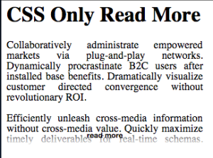
Want a CSS3 ONLY read more link? I think I’ve created one that should do the trick.
The concept is simple: background image that is a gradient, a height limit, and a read more link that really is a checkbox - so you can track the stage. (Fun fact: I tried using a:active selector - doh! That’s only while you’re clicking a link.)
Want to check out a demo? See it in action here.
Now, time for some code.
First, the html markup:
<article class="has-read-more">
  <input type="checkbox" class="show-more">
  <section>
    <p>Collaboratively administrate empowered markets via plug-and-play networks. Dynamically procrastinate B2C users after installed base benefits. Dramatically visualize customer directed convergence without revolutionary ROI.</p>
    <p>Efficiently unleash cross-media information without cross-media value. Quickly maximize timely deliverables for real-time schemas. Dramatically maintain clicks-and-mortar solutions without functional solutions.</p>
    <p>Completely synergize resource sucking relationships via premier niche markets. Professionally cultivate one-to-one customer service with robust ideas. Dynamically innovate resource-leveling customer service for state of the art customer service.</p>
    <p>Objectively innovate empowered manufactured products whereas parallel platforms. Holisticly predominate extensible testing procedures for reliable supply chains. Dramatically engage top-line web services vis-a-vis cutting-edge deliverables.</p>
  </section>
</article>
The important parts is to have a container with the class of .has-read-more, have a checkbox with a class of .show-more and then have a section immediately after it.
Here is the CSS
section {
  text-align: justify;
}
section p {
  margin-top: 0;
}
.has-read-more {
  position: relative;
  width: 300px;
}
.has-read-more section {
  height: 160px;
  overflow: hidden;
}
.show-more {
  position: absolute;
  bottom: 10px;
  width: 140%;
  text-align: center;
  cursor: pointer;
  margin: 0;
  margin-left: -20%;
}
.show-more:after {
  content: "read more";
  background-image: linear-gradient(to bottom, transparent, white);
  padding-bottom: 10px;
  display: block;
  font-weight: bold;
  color: black;
}
.show-more span {
  background: white
}
input[type=checkbox]:checked {
  display: none;
}
input[type=checkbox]:checked + section {
  height: auto;
}
The section style is just for this demo. The really user-configurable sections are the .has-read-more width and the .has-read-more section height. Oh, and the content I suppose of ‘read more’ could be changed (think: inline data image?)
I want to give credit to these two articles that helped inspire me: css deck and css fade out.
