Google Map Markers Distorted with Bootstrap
May 28, 2013
css
This post is more than 18 months old. Since technology changes too rapidly, this content may be out of date (but
that's not always the case). Please remember to verify any technical or programming information with the current
release.
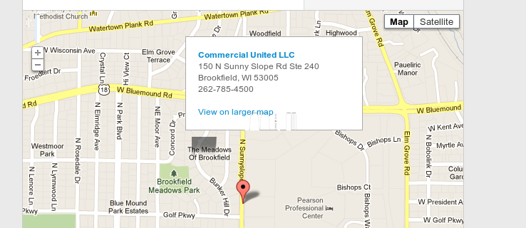
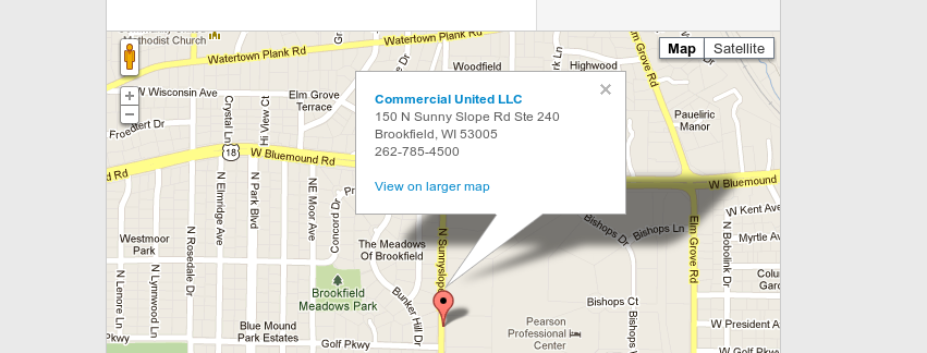
On a recent project, the dev team installed Twitter Bootstrap as the base for our CSS. For some reason, I was the only one seeing a problem with Google Maps. Their Windows and Mac browsers of both Chrome and Firefox were displaying the marker fine. (Part of me doesn’t believe that entirely but….). At any rate, my Chrome browser on ubuntu was not showing the marker properly. This is what it looked like:
I finally tracked down that it was some default styles in Bootstrap that were causing the issue. I added this rule to our css:
#googlemap img[src^="http://maps.gstatic.com/"] {
  max-width: none;
}
And, we were good to go. Proof:

