Equal distance menu items
Sep 3, 2013
css
This post is more than 18 months old. Since technology changes too rapidly, this content may be out of date (but
that's not always the case). Please remember to verify any technical or programming information with the current
release.
I’ve been having this challenge - I really want to have menu items in the CMS to be equally distributed - but I don’t want them to go over the edge of the page. It’s like, I want them to wrap. I’ve been doing some work with display: table-cell.
Finally, after a bit of research, I came across the idea of using text-justify…
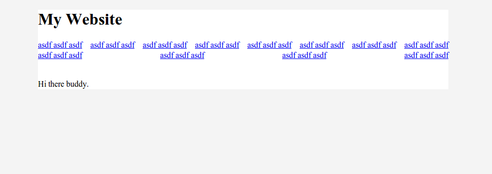
This screenshot is my final output:
So here’s the markup:
<div id="main">
  <h1>My Website</h1>
  <nav>
    <ul>
      <li><a href="#">asdf asdf asdf</a></li>
      <li><a href="#">asdf asdf asdf</a></li>
      <li><a href="#">asdf asdf asdf</a></li>
      <li><a href="#">asdf asdf asdf</a></li>
      <li><a href="#">asdf asdf asdf</a></li>
      <li><a href="#">asdf asdf asdf</a></li>
      <li><a href="#">asdf asdf asdf</a></li>
      <li><a href="#">asdf asdf asdf</a></li>
      <li><a href="#">asdf asdf asdf</a></li>
      <li><a href="#">asdf asdf asdf</a></li>
      <li><a href="#">asdf asdf asdf</a></li>
      <li><a href="#">asdf asdf asdf</a></li>
    </ul>
  </nav>

  <p>Hi there buddy.</p>
</div>
And then the CSS
body {
  background: #f4f4f4;
}
#main {
  background: #fff;
  width: 800px;
  margin: auto;
}
nav ul {
  text-align:justify;
  padding: 0px;
}
nav li {
  list-style-type: none;
  display: inline;
}
nav li > a {
  display: inline-block
}
nav ul:after {
  content: ' ';
  display: inline-block;
  width: 100%;
  height: 0
}