Trim down your content - it is a MUST
A while ago, I was reading a usability book - and the author suggested that every time you create your content, remove half of the words. Then remove half of them again. So, by the time you’re done, you really have 1/4th of your content - and it should still make sense.
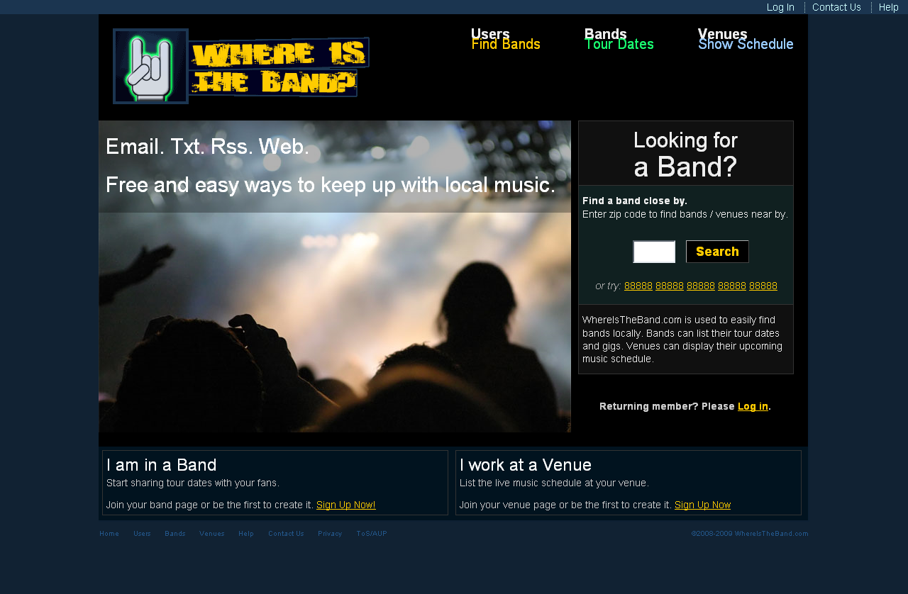
I didn’t really think this was that useful, until I made my first version of project I was developing called Where Is The Band (the picture on the left). As you can see, the general idea was the same, but it was very busy and verbose. The new version (the picture on the right) shows the exact same interface, but measurably less content.
This is how I did it:
Take out assumptions
Part of the extra wording I did was to explain “what would happen.” The hope is, however, that if a user is taking the time to sign up for your website, they already trust you enough to know that you’ll do those things you’ve promised. So, there is no need for me to spit out all of this information right away. (see: If you have a page, we’ll search for it! - they should trust that this happens already).
Trust Common Sense
Another area I was too verbose was the zip code box search. I realized that most people will know that a band is at a venue. Also, I planned on showing both results - as a combined search - here are venues near by with their associated bands. So, this new combo message worked better.
Elevator Pitch Ax
Elevator pitches in the real world are about 30 seconds max. In the web world, you have 3 seconds. Any longer than that, they move on. I imagined my elevator pitch - the part below the zip code search - as being my 3 main points said in one second each.
Value whitespace
In areas where I didn’t know what to cut, I decided I must have enough whitespace (or in this case, blue space). I then forced my words to work around that space that I had cut out.
Thesaurus.com and Lingo/Slang
Last but not least, check out the thesaurus. Also, from time to time, I used real words that people use - not the proper written words. This helped shorten the content.
The Examples
This top picture is the original design.
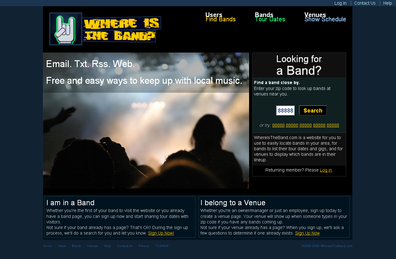
This second picture is the trimmed version.