Creating a Google Fusion Table from a Google Drive Spreadsheet
Wow! Enter Google Fusion Tables - an easy way to show, manipulate, sort and display data.
I wanted to see how easy this actually was. I was surfing around on one of my favorite websites, Milwaukee Biz Journal, and I saw this article: MKE City Building Values. I thought, that slideshow seems like a great source of data I’d like to see in sortable, mappable information.
tl;dr Top Milwaukee Building Values Fusion Table
First thing’s first, I created a Google Drive Spreadsheet (looks like you can upload your own data as well if you want.) I made it have columns for the name of the building, the address, the 2015 value, 2014 value, and an image from the original article (Thanks MKE Biz Journal!)
Next, I scanned a tutorial about Fusion tables located here: About Fusion Tables - and clicked to make one.
And this is where we begin!
Selecting the Source
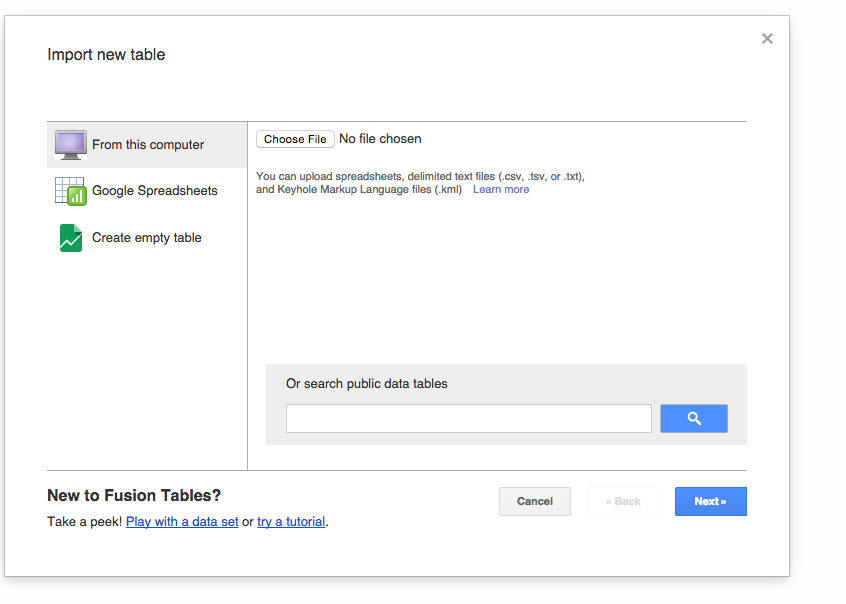
I chose to use a Google Drive Spreadsheet.
Validating the Layout
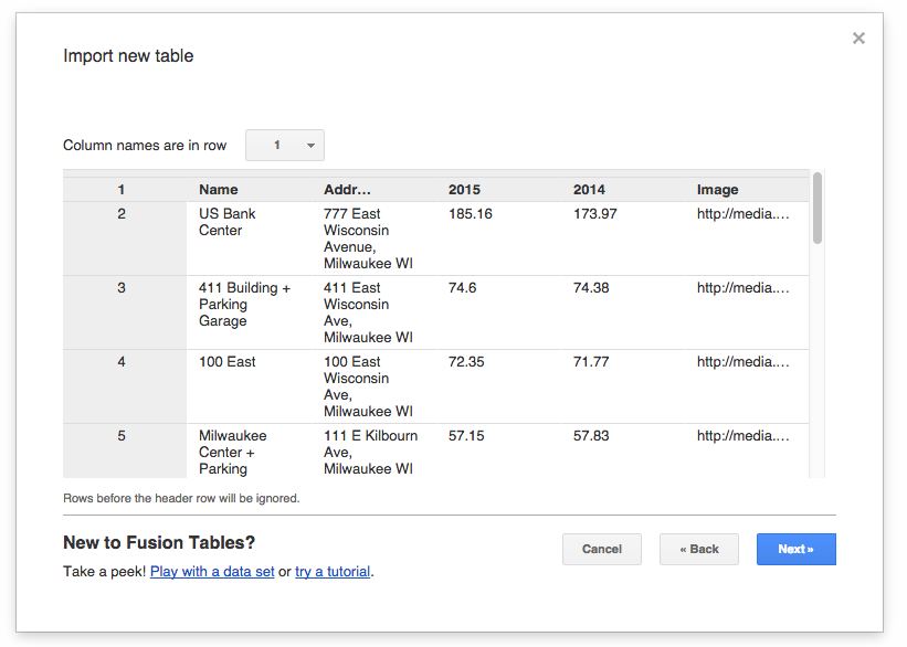
Yup, everything looks good. I really like the option of choosing the header / label row too. Sometimes you might want to make a report from data farther down on a street.
Adding the Meta Data
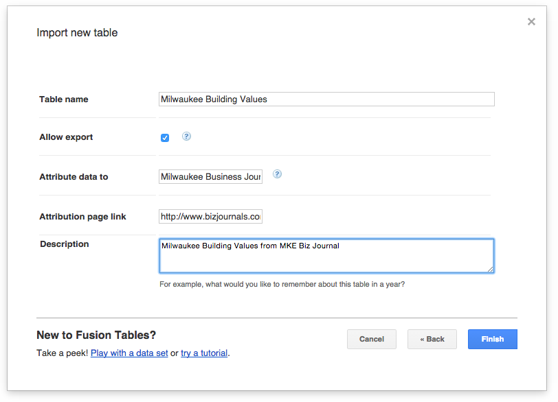
I think its important to give attribution to sources when you use them. Here, I did so with MKE Biz Journal.
Click Finish!
The first result

As you can tell - it’s pretty boring right now. But, let’s make it a little bit more user friendly. I’ve decided to rename the columns to ‘Source Data’, ‘Cards’ and ‘Building Locations.’ When I clicked on the locations tab, however, it decided to do all the geo-location:
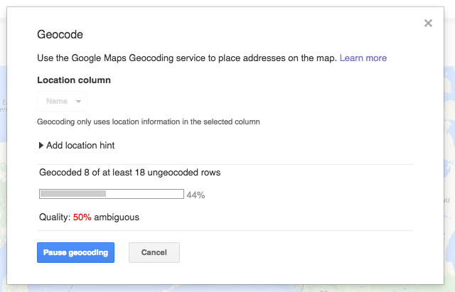
That only took a little while - and then I had my map. But it was WAY zoomed out. ** AND ** I couldn’t find my locations anywhere. Turns out there is an option on the left to select which column you want to map. It had defaulted to “Name” - so I chose address - and then it re-geocoded. This actually re-focused it - closer to Wisconsin, but that’s not perfect yet. Turns out, I had to center and zoom the map manually - but that was fine.
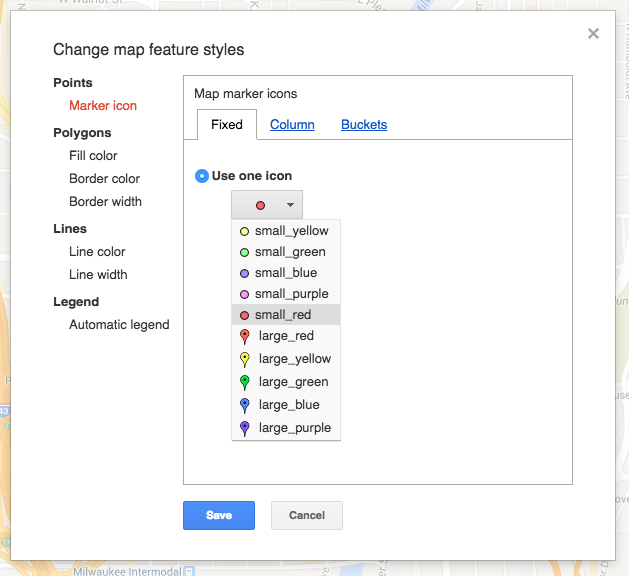
There are other map configuration options too. The default placeholder was a simple dot - but I wanted the familiar balloon. So, I chose that option. On the left hand, choose Feature Map -> Choose feature styles. You’ll see something like this:
The next thing I wanted to do was configure the info window. This is on the left side too: Feature Map -> Change Info Window. I decided I would want the name, address, values and picture to be in the info window. By default, it renders all of the information automatically like shown below:
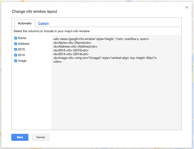
I decided to write my own HTML to customize the view. You can click on the custom tab and do the following:
<div style="height: 11em; overflow-y: auto" class="googft-info-window">
  <img src="{Image}" style="float:right; height: 10em; margin-left: 0.5em"></img>
  <b>{Name}</b><br>
  {Address}<br>
  <hr>
  2015: ${2015}<br>
  <span style="color: #aaa">2014: ${2014}</span><br>
</div>

Ugh - inline style. But, what can ya do?
Anyway, this makes a pretty good looking info window for our purposes.
Final Part
Click Tools -> Publish and choose to change the visibility. You must make this public so you can share it or embed it. I chose the option to make it visible to anyone with a link.
So again, here is your link!